Once someone, somewhere creates a specific home décor and passes it down generations, it becomes a rule of thumb. However, it is not compulsory to adhere to these decorating rules. So, today let me share with you some home decorating myths that are binding and stopping you from unleashing your creativity.
#1. Always Stick to One Design Style Only

Who doesn’t like variety? Nearly everyone does, whether in clothes, movies or food. Then, I don’t understand the logic of imposing only a single design style to our homes. Instead, as claimed by Lindsay Agnew, a Toronto-based design expert, “picking only one style and sticking to it can be pretty boring.”
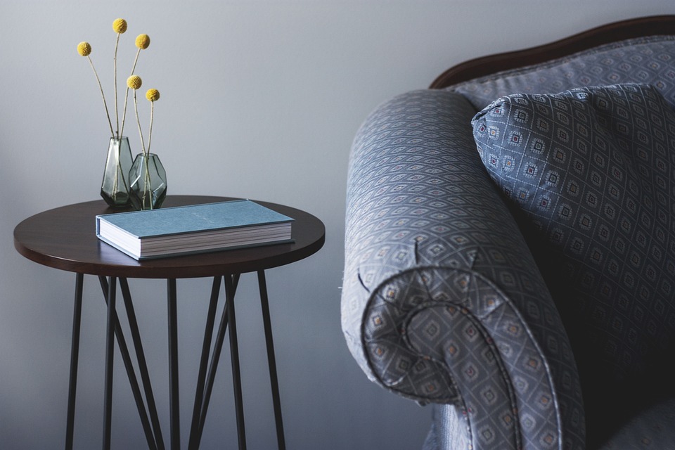
Each home is unique on its own and should be stylized in that way. For instance, a home can be modern but still include antiques and a mix of boho. To make a room interesting, you can also combine traditional, contemporary and transitional pieces. Here’s the trick: you have to balance them strategically so as it is pleasing to the eye. Another example is how my friend in India uses the same color in a traditional chair and modern couch.
So, all homeowners out there, trust me as having multiples styles can give a layered and exciting effect to your home.
#2. Always Keep Your Art High Up

Another common, but strange, home decorating myth is that you should always put your art pieces high up. The reason why? So as other decorative elements such as flower vases do not obscure your art. Honestly, according to me, instead this can look rather awkward and impersonal. And, there’s nothing wrong even if other decorative elements are covering the corner of an artwork.
So, what I recommend you is to move your art lower. Hang it like how a museum does: at eye level. In this way, your guests don’t have to crane their necks to take a look at and appreciate an artwork in your house.
#3. Dark Colors Can Make a Room Look Smaller

One of the oldest home design myths that has gained so much momentum and that people are still following is that dark colors can make a space look smaller. But this needs to go away and now!
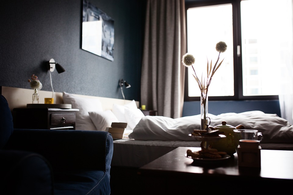
Instead, let me tell you that dark colors can add warmth, texture and dimension to a room. For instance, moody hues can add a certain level of sophistication, glamour and drama. They can also make your room look cozier.
Furthermore, dark walls are wonderful canvas to work with. For instance, placing a simple piece of art on a dark wall can make such a powerful statement. That is why many home designers recommend dark-colored rooms as they are perfect places that enhance the visibility of handcrafted and vintage art.
#4. Furniture Should Always Be Placed Against the Wall

By default we often, if not always, tend to line up our furniture against the wall because we think that pieces of furniture should be grounded against something. This is where we go wrong. We don’t realize that by doing so, we encourage foot traffic in front of the furniture.
Moreover, as per Lindsay, “many people do not know how to float furniture or how to space plan correctly.”
Now, what is furniture floating? It simply means that you place your pieces of furniture off the wall, for example, it can be in the middle of the room. In this way, you can create an illusion of having more space. So, as per the designer, if you put in a lot of time and efforts and have a designer’s eye, you will achieve this.
#5. Couch Is the Most Important Thing

Over the years, people have attached more and more importance to a living room’s couch for various reasons. However, a couch alone is not the only hero in a house. If you want to make a prominent statement, you can have a dining table or another piece of furniture or even some artwork. For example, you can even make a bunch of mirrors become a room’s focal point.
Will you now create and make your own home decorating rules? Please share your comments!
 Divers
 Divers